文本阴影

h1 { text-shadow: 5px 5px 5px #FF0000; }
box-shadow 属性适用于盒子阴影
div { box-shadow: 10px 10px 5px #888888; }
卡片效果
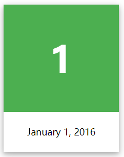
<!DOCTYPE html>
<html>
<head>
    <meta charset="UTF-8" />
    <title>Hello React!</title>
    <style>
        div.card {
            width: 250px;
            box-shadow: 0 4px 8px 0 rgba(0, 0, 0, 0.2), 0 6px 20px 0 rgba(0, 0, 0, 0.19);
            text-align: center;
        }

        div.header {
            background-color: #4CAF50;
            color: white;
            padding: 10px;
            font-size: 40px;
        }

        div.container {
            padding: 10px;
        }
    </style>
</head>
<body>

    <h2>卡片</h2>

    <p>box-shadow 属性用来可以创建纸质样式卡片:</p>

    <div class="card">
        <div class="header">
            <h1>1</h1>
        </div>

        <div class="container">
            <p>January 1, 2016</p>
        </div>
    </div>
</body>
</html>Code language: HTML, XML (xml)
CSS3 Text Overflow属性
CSS3文本溢出属性指定应向用户如何显示溢出内容
<!DOCTYPE html>
<html>
<head>
<meta charset="UTF-8" />
<title>Hello React!</title>
<style>
div.test {
white-space: nowrap;
width: 12em;
overflow: hidden;
border: 1px solid #000000;
}
</style>
</head>
<body>
<p>以下 div 容器内的文本无法完全显示,可以看到它被裁剪了。</p>
<p>div 使用 "text-overflow:ellipsis":</p>
<div class="test" style="text-overflow:ellipsis;">This is some long text that will not fit in the box</div>
<p>div 使用 "text-overflow:clip":</p>
<div class="test" style="text-overflow:clip;">This is some long text that will not fit in the box</div>
<p>div 使用自定义字符串 "text-overflow: >>"(只在 Firefox 浏览器下有效):</p>
<div class="test" style="text-overflow:'>>';">This is some long text that will not fit in the box</div>
</body>
</html>Code language: HTML, XML (xml)单词换行
如果某个单词太长,不适合在一个区域内,它扩展到外面:
CSS3中,自动换行属性允许您强制文本换行 – 即使这意味着分裂它中间的一个字
<style>
p.test
{
	width:11em;
	border:1px solid #000000;
	word-wrap:break-word;
}
</style>
</head>
<body>

<p class="test"> This paragraph contains a very long word: thisisaveryveryveryveryveryverylongword. The long word will break and wrap to the next line.</p>

</body>Code language: HTML, XML (xml)
Previous: 通过角度来控制渐变效果
Next: 字体