弹性盒子是 CSS3 的一种新的布局模式。
CSS3 弹性盒( Flexible Box 或 flexbox),是一种当页面需要适应不同的屏幕大小以及设备类型时确保元素拥有恰当的行为的布局方式。
引入弹性盒布局模型的目的是提供一种更加有效的方式来对一个容器中的子元素进行排列、对齐和分配空白空间。
弹性盒子由弹性容器(Flex container)和弹性子元素(Flex item)组成。
弹性容器通过设置 display 属性的值为 flex 或 inline-flex将其定义为弹性容器。
弹性容器内包含了一个或多个弹性子元素。
<style>
.flex-container {
    display: -webkit-flex;
    display: flex;
    width: 400px;
    height: 250px;
    background-color: lightgrey;
}

.flex-item {
    background-color: cornflowerblue;
    width: 100px;
    height: 100px;
    margin: 10px;
}
</style>
</head>
<body>

<div class="flex-container">
  <div class="flex-item">flex item 1</div>
  <div class="flex-item">flex item 2</div>
  <div class="flex-item">flex item 3</div>
</div>

</body>Code language: HTML, XML (xml)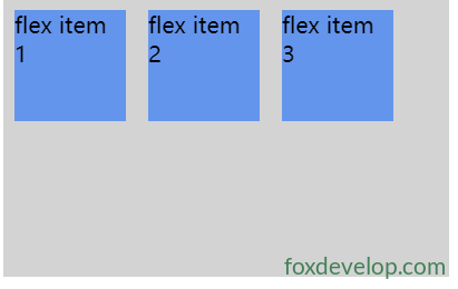
当然我们可以修改排列方式。
如果我们设置 direction 属性为 rtl (right-to-left),弹性子元素的排列方式也会改变,页面布局也跟着改变:
<style>
body {
    direction: rtl;
}

.flex-container {
    display: -webkit-flex;
    display: flex;
    width: 400px;
    height: 250px;
    background-color: lightgrey;
}

.flex-item {
    background-color: cornflowerblue;
    width: 100px;
    height: 100px;
    margin: 10px;
}
</style>
</head>
<body>

<div class="flex-container">
  <div class="flex-item">flex item 1</div>
  <div class="flex-item">flex item 2</div>
  <div class="flex-item">flex item 3</div>
</div>Code language: HTML, XML (xml)
flex-direction 属性指定了弹性子元素在父容器中的位置。
flex-direction的值有:
- row:横向从左到右排列(左对齐),默认的排列方式。
- row-reverse:反转横向排列(右对齐,从后往前排,最后一项排在最前面。
- column:纵向排列。
- column-reverse:反转纵向排列,从后往前排,最后一项排在最上面。
<style>
.flex-container {
    display: -webkit-flex;
    display: flex;
    -webkit-flex-direction: row-reverse;
    flex-direction: row-reverse;
    width: 400px;
    height: 250px;
    background-color: lightgrey;
}

.flex-item {
    background-color: cornflowerblue;
    width: 100px;
    height: 100px;
    margin: 10px;
}
</style>
</head>
<body>

<div class="flex-container">
  <div class="flex-item">flex item 1</div>
  <div class="flex-item">flex item 2</div>
  <div class="flex-item">flex item 3</div>
</div>Code language: HTML, XML (xml)
内容对齐(justify-content)属性应用在弹性容器上,把弹性项沿着弹性容器的主轴线(main axis)对齐。
justify-content 语法如下:
justify-content: flex-start | flex-end | center | space-between | space-around
Previous: 面包屑