一、提醒框概述
提醒框用于向用户展示重要信息、状态反馈或操作结果。使用 .alert-box 类创建,配合 data-alert 属性实现交互功能。
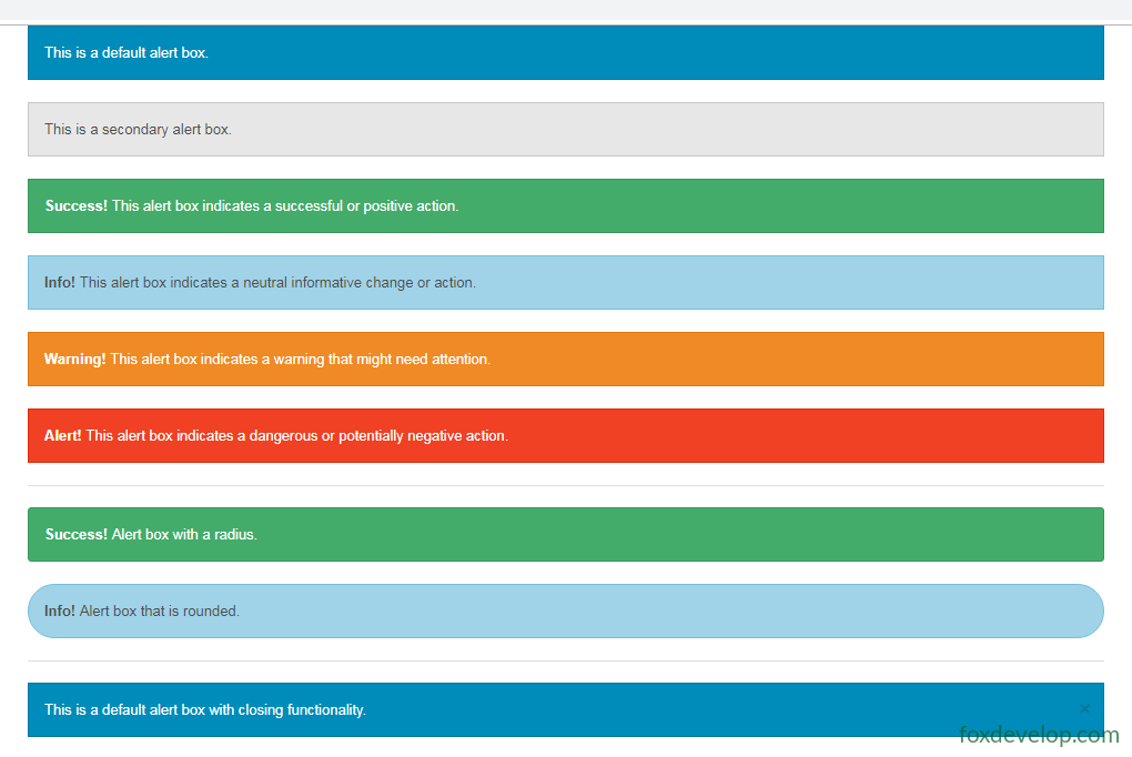
Foundation 提供 6 种颜色变体:
- 默认(蓝色)
.secondary(灰色).success(绿色).info(浅蓝色).warning(黄色/橙色).alert(红色)
二、基础提醒框
<div data-alert class="alert-box">
    This is a default alert box.
</div>

<div data-alert class="alert-box secondary">
    This is a secondary alert box.
</div>

<div data-alert class="alert-box success">
    <strong>Success!</strong> This alert box indicates a successful or positive action.
</div>

<div data-alert class="alert-box info">
    <strong>Info!</strong> This alert box indicates a neutral informative change or action.
</div>

<div data-alert class="alert-box warning">
    <strong>Warning!</strong> This alert box indicates a warning that might need attention.
</div>

<div data-alert class="alert-box alert">
    <strong>Alert!</strong> This alert box indicates a dangerous or potentially negative action.
</div>Code language: HTML, XML (xml)
三、圆角提醒框
使用 .radius 和 .round 类为提醒框添加圆角效果:
<div data-alert class="alert-box success radius">
    <strong>Success!</strong> Alert box with a radius.
</div>

<div data-alert class="alert-box info round">
    <strong>Info!</strong> Alert box that is rounded.
</div>Code language: HTML, XML (xml)
四、可关闭的提醒框
要启用关闭功能,需在提醒框内添加带 .close 类的链接或按钮,并确保已初始化 Foundation JS:
<div data-alert class="alert-box">
This is a default alert box with closing functionality.
<a href="#" class="close">×</a>
</div>Code language: HTML, XML (xml)点击
×即可关闭提醒框。关闭功能依赖 Foundation 的 JavaScript 组件初始化。
五、完整可运行示例
<!DOCTYPE html>
<html>
<head>
<meta http-equiv="Content-Type" content="text/html; charset=utf-8" />
<title>Foundation 提醒框示例</title>
<meta charset="utf-8" />
<meta name="viewport" content="width=device-width, initial-scale=1">
<link href="foundation-5.5.3/css/foundation.css" rel="stylesheet" />
<script src="foundation-5.5.3/js/vendor/jquery.js"></script>
<script src="foundation-5.5.3/js/foundation.min.js"></script>
<script src="foundation-5.5.3/js/vendor/modernizr.js"></script>
<script>
$(document).ready(function () {
$(document).foundation();
})
</script>
<style>
.alert-box {
margin-bottom: 15px;
}
</style>
</head>
<body>
<div class="row">
<div class="medium-12 columns">
<h3>基础提醒框</h3>
<div data-alert class="alert-box">
This is a default alert box.
</div>
<div data-alert class="alert-box secondary">
This is a secondary alert box.
</div>
<div data-alert class="alert-box success">
<strong>Success!</strong> This alert box indicates a successful or positive action.
</div>
<div data-alert class="alert-box info">
<strong>Info!</strong> This alert box indicates a neutral informative change or action.
</div>
<div data-alert class="alert-box warning">
<strong>Warning!</strong> This alert box indicates a warning that might need attention.
</div>
<div data-alert class="alert-box alert">
<strong>Alert!</strong> This alert box indicates a dangerous or potentially negative action.
</div>
<hr />
<h3>圆角提醒框</h3>
<div data-alert class="alert-box success radius">
<strong>Success!</strong> Alert box with a radius.
</div>
<div data-alert class="alert-box info round">
<strong>Info!</strong> Alert box that is rounded.
</div>
<hr />
<h3>可关闭的提醒框</h3>
<div data-alert class="alert-box">
This is a default alert box with closing functionality.
<a href="#" class="close">×</a>
</div>
<div data-alert class="alert-box success">
<strong>Success!</strong> You can close this alert box.
<a href="#" class="close">×</a>
</div>
<div data-alert class="alert-box warning">
<strong>Warning!</strong> Please pay attention to this message.
<a href="#" class="close">×</a>
</div>
</div>
</div>
</body>
</html>Code language: HTML, XML (xml)六、使用要点小结
| 功能 | 实现方式 |
|---|---|
| 创建提醒框 | class="alert-box" + data-alert |
| 颜色变体 | .secondary .success .info .warning .alert |
| 圆角 | .radius .round |
| 关闭按钮 | 内部添加 <a href="#" class="close">×</a> |
| 初始化 | 需调用 $(document).foundation() |
Previous: Foundation 标签(Label)