37-UWP开发-命令栏/菜单栏CommandBar
命令栏 CommandBar 也是程序中菜单栏控件,它作为底部的菜单栏使用。Page 页面的 BottomAppBar 属性表示页面的底部菜单栏。
菜单栏有两种类型的按钮:一种是圆形的图形按钮,另一种是文字的菜单按钮。这两种按钮都是使用 AppBarButton 控件来表示,只不过文字的菜单按钮需要放在 CommandBar 控件的 SecondaryCommands 属性上。
控件的XAML语法
<Page.BottomAppBar>
    <CommandBar>
        <AppBarButton/>
        ...
        <CommandBar.SecondaryCommands>
            <AppBarButton/>
            ...
        </CommandBar.SecondaryCommands>
    </CommandBar>
</Page.BottomAppBar>Code language: HTML, XML (xml)
对于 CommandBar 里面的应用栏按钮控件 AppBarButton,通常设置其 Label 和 Icon 属性用于定义应用栏按钮的内容。Label 属性用于设置按钮的文本标签,Icon 属性用于设置按钮的图形。
图形的图标可以使用下面的四类:
- FontIcon:基于来自指定字体系列的字型
- BitmapIcon:基于带指定 URI 的位图图形文件
- PathIcon:基于 Path 数据
- SymbolIcon:基于 Segoe UI Symbol 字体的字型预定义列表
这些菜单按钮可以通过相应的 Click 事件来进行相关的操作,也可以通过绑定 Command 命令来发送相关命令。
默认命令栏是在顶部的:
<CommandBar>
    <AppBarButton>dd</AppBarButton>
</CommandBar>Code language: HTML, XML (xml)
如果我们在外面套上一个 <Page.BottomAppBar> 则显示在底部:
<Page.BottomAppBar>
    <CommandBar>
        <AppBarButton>dd</AppBarButton>
    </CommandBar>
</Page.BottomAppBar>Code language: HTML, XML (xml)
练一练
<Page.BottomAppBar>
<CommandBar>
<AppBarButton Icon="Add"/>
<AppBarButton>
<AppBarButton.Icon>
<BitmapIcon UriSource="images/093007omy75nd2azzy7w2y.png"/>
</AppBarButton.Icon>
</AppBarButton>
<AppBarButton>
<AppBarButton.Icon>
<FontIcon FontFamily="Candara" Glyph="Σ"/>
</AppBarButton.Icon>
</AppBarButton>
<AppBarButton Label="查看" Click="AppBarButton_Click" Icon="Admin"/>
<CommandBar.SecondaryCommands>
<AppBarButton Label="about"/>
<AppBarButton Label="删除"/>
<AppBarButton Label="回复"/>
</CommandBar.SecondaryCommands>
</CommandBar>
</Page.BottomAppBar>Code language: HTML, XML (xml)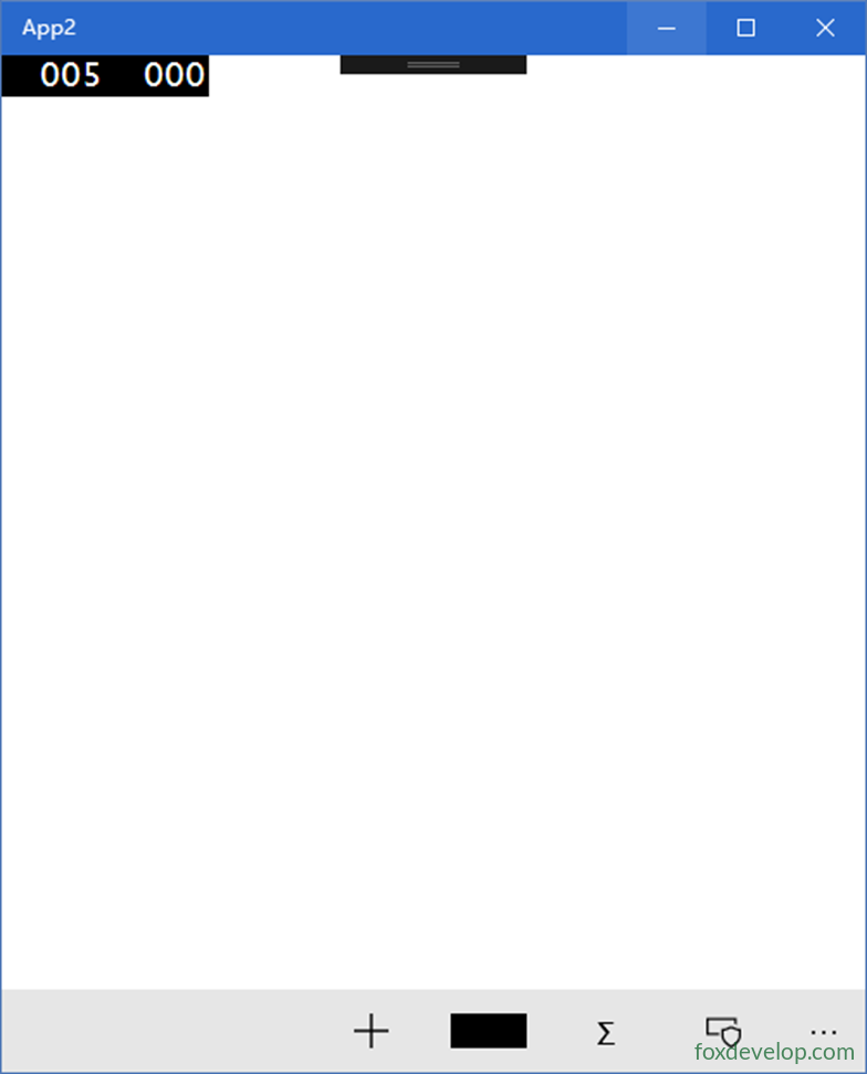
Previous: 相对布局RelativePanel
Next: 分屏控件SplitView