タブレットは通常デュアルペインモードを使用
スマートフォンは通常シングルペインモードを使用します。
しかし、どうすれば1つのアプリで画面サイズに応じて自動的に切り替えられるでしょうか?
実は、Android でこれを実現するのはとても簡単です。
画像やアイコンなどのリソースと同様に、システムには自動適応する機能が備わっています。
高解像度の画面には、xhdpi サフィックスのフォルダが使用されます。
レイアウトについても同じことが言えます。
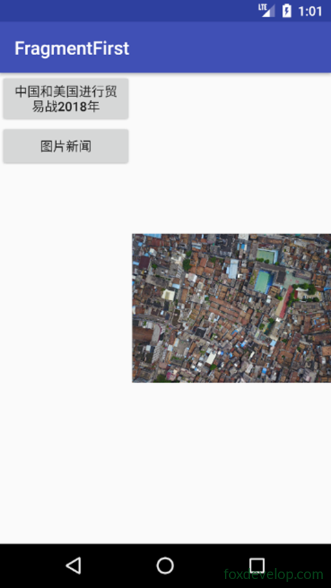
スマートフォンでデュアルペインモードを確認する
フォルダを追加
res に layout-large ディレクトリを追加
大画面で使用するレイアウトを示します
次に activity_main.xml をコピーします
そして layout フォルダ内の activity_main.xml を修正します
<![CDATA[<?xml version="1.0" encoding="utf-8"?>
<LinearLayout xmlns:android="http://schemas.android.com/apk/res/android"
    android:orientation="horizontal" android:layout_width="match_parent"
    android:layout_height="match_parent">
    <fragment
        android:id="@+id/newlist_fragment"
        android:layout_width="match_parent"
        android:layout_height="match_parent"
        android:name="com.foxdevelop.www.fragmentfirst.NewListFragment"
        />
</LinearLayout>]]>Code language: JavaScript (javascript)
layout-large/activity_main.xml を修正
フレームレイアウトを削除し、フラグメントタグに置き換えます
<![CDATA[<?xml version="1.0" encoding="utf-8"?>
<LinearLayout xmlns:android="http://schemas.android.com/apk/res/android"
    android:orientation="horizontal" android:layout_width="match_parent"
    android:layout_height="match_parent">
    <fragment
        android:id="@+id/newlist_fragment"
        android:layout_width="0dp"
        android:layout_height="match_parent"
        android:layout_weight="2"
        android:name="com.foxdevelop.www.fragmentfirst.NewListFragment"
        />

    <fragment
        android:id="@+id/newlist_fragment2"
        android:layout_width="0dp"
        android:layout_height="match_parent"
        android:layout_weight="2"
        android:name="com.foxdevelop.www.fragmentfirst.NewDetailFragment"
        />
</LinearLayout>]]>Code language: JavaScript (javascript)
スマートフォンエミュレータ上
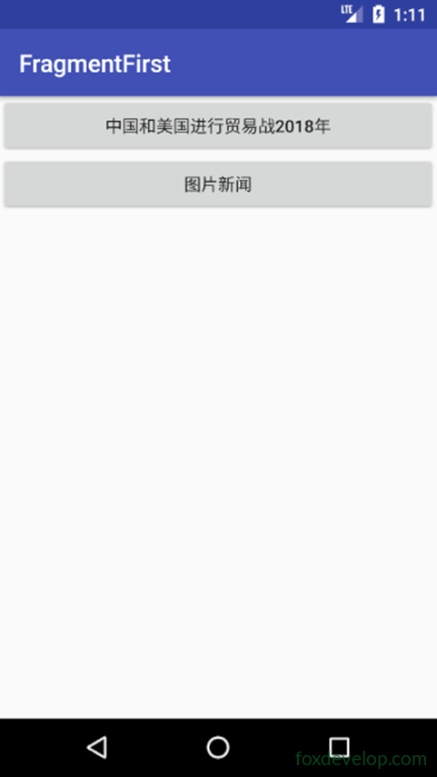
タブレットエミュレータ上
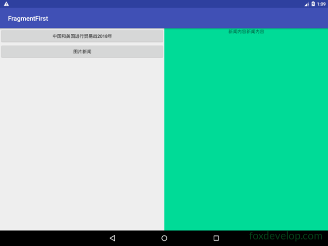
解像度と修飾子の参照表
スマートフォンとタブレットでビューを自動選択
Previous: フラグメント Fragment