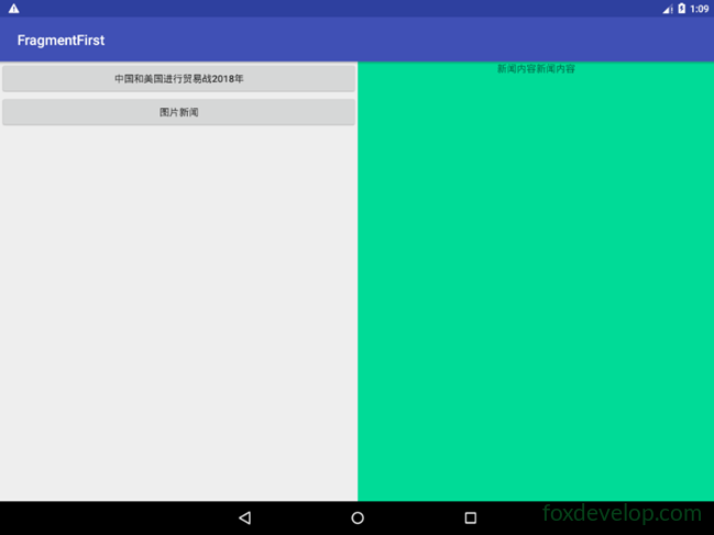
Tablets typically use a dual‑pane layout
Phones generally use a single‑pane layout.
But how can we make an app automatically adapt to different screen sizes?
Actually, this is quite simple to achieve on Android.
Just like how the system automatically adapts images and icons, it provides built‑in support for that.
For higher‑resolution screens, we use the xhdpi suffix folder.
The same idea applies to layouts.
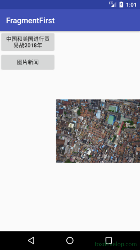
Viewing the dual‑pane mode on a phone
Add a folder
Create a layout‑large directory in res
This indicates the layout to use on large screens
Then copy activity_main.xml
And modify it to become activity_main.xml under the layout folder
<![CDATA[<?xml version="1.0" encoding="utf-8"?>
<LinearLayout xmlns:android="http://schemas.android.com/apk/res/android"
    android:orientation="horizontal" android:layout_width="match_parent"
    android:layout_height="match_parent">
    <fragment
        android:id="@+id/newlist_fragment"
        android:layout_width="match_parent"
        android:layout_height="match_parent"
        android:name="com.foxdevelop.www.fragmentfirst.NewListFragment"
        />
</LinearLayout>]]>Code language: JavaScript (javascript)
Modify layout‑large/activity_main.xml
Remove the frame layout and replace it with fragment tags
<![CDATA[<?xml version="1.0" encoding="utf-8"?>
<LinearLayout xmlns:android="http://schemas.android.com/apk/res/android"
    android:orientation="horizontal" android:layout_width="match_parent"
    android:layout_height="match_parent">
    <fragment
        android:id="@+id/newlist_fragment"
        android:layout_width="0dp"
        android:layout_height="match_parent"
        android:layout_weight="2"
        android:name="com.foxdevelop.www.fragmentfirst.NewListFragment"
        />

    <fragment
        android:id="@+id/newlist_fragment2"
        android:layout_width="0dp"
        android:layout_height="match_parent"
        android:layout_weight="2"
        android:name="com.foxdevelop.www.fragmentfirst.NewDetailFragment"
        />
</LinearLayout>]]>Code language: JavaScript (javascript)
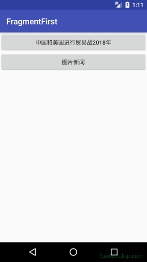
On a phone emulator
On a tablet emulator
Reference table for resolutions and qualifiers
Automatic view selection for phones and tablets