Four Basic Layouts
A layout is a container used to hold many controls. It can adjust the position of its child controls according to certain rules.
With it, you can build beautiful user interfaces.
Layouts can also be nested inside other layouts.
Layout – LinearLayout
LinearLayout, very commonly used
As its name suggests, controls contained within it are arranged sequentially along a linear axis.
Use the android:orientation attribute to set the arrangement direction: vertical or horizontal
Basic Syntax
<?xml version="1.0" encoding="utf-8"?>
<LinearLayout
    xmlns:android="http://schemas.android.com/apk/res/android"
    android:orientation="vertical"
    android:layout_width="match_parent"
    android:layout_height="match_parent"
    >
</LinearLayout>Code language: HTML, XML (xml)
Let’s try it out
Create a new layout and modify the main activity to load this layout
<LinearLayout
    xmlns:android="http://schemas.android.com/apk/res/android"
    android:orientation="vertical"
    android:layout_width="match_parent"
    android:layout_height="match_parent"
    >
    <Button
        android:id="@+id/button1"
        android:layout_width="wrap_content"
        android:layout_height="wrap_content"
        android:text="1"
        />
    <Button
        android:id="@+id/button2"
        android:layout_width="wrap_content"
        android:layout_height="wrap_content"
        android:text="2"
        />
    <Button
        android:id="@+id/button3"
        android:layout_width="wrap_content"
        android:layout_height="wrap_content"
        android:text="3"
        />
</LinearLayout>Code language: HTML, XML (xml)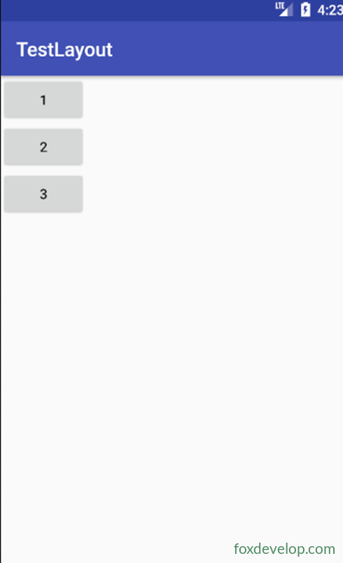
The main activity loads this layout
setContentView(R.layout.test_linear);
Switch to vertical arrangement
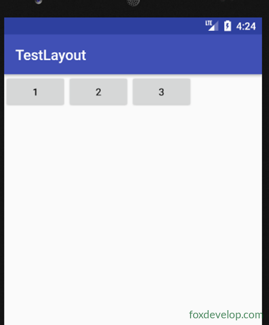
android:orientation=”horizontal”
Layout – Alignment of child controls in LinearLayout
Set android:layout_gravity to define the alignment of controls inside the layout.
When LinearLayout uses horizontal orientation, only vertical alignment settings take effect. The horizontal dimension is unfixed in this case.
<?xml version="1.0" encoding="utf-8"?>
<LinearLayout
    xmlns:android="http://schemas.android.com/apk/res/android"
    android:orientation="horizontal"
    android:layout_width="match_parent"
    android:layout_height="match_parent"
    >
    <Button
        android:id="@+id/button1"
        android:layout_width="wrap_content"
        android:layout_height="wrap_content"
        android:layout_gravity="top"
        android:text="1"
        />
    <Button
        android:id="@+id/button2"
        android:layout_width="wrap_content"
        android:layout_height="wrap_content"
        android:text="2"
        android:layout_gravity="center"
        />
    <Button
        android:id="@+id/button3"
        android:layout_width="wrap_content"
        android:layout_height="wrap_content"
        android:text="3"
        android:layout_gravity="bottom"
        />
</LinearLayout>Code language: HTML, XML (xml)
In short, when orientation is horizontal, top / center / bottom alignment works for controls
Layout – Control proportional sizing in LinearLayout
If we set the child control width to 0dp
We can then use
android:layout_weight=”n” to assign proportional space for controls inside the layout
P108
We can also mix controls with weight and controls without weight
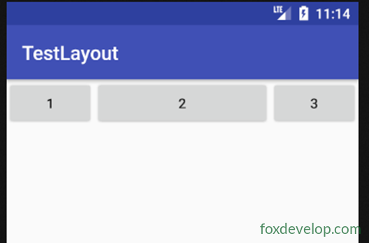
Some use weight, others do not
In this example, buttons retain their original width. This pattern is very useful
<?xml version="1.0" encoding="utf-8"?>
<LinearLayout xmlns:android="http://schemas.android.com/apk/res/android"
    android:orientation="horizontal" android:layout_width="match_parent"
    android:layout_height="match_parent">
    <Button
        android:id="@+id/button1"
        android:layout_width="0dp"
        android:layout_weight="1"
        android:layout_height="wrap_content"
        android:text="1"        />
    <Button
        android:id="@+id/button2"
        android:layout_width="0dp"
        android:layout_weight="2"
        android:layout_height="wrap_content"
        android:text="2"        />
    <Button
        android:id="@+id/button3"
        android:layout_width="0dp"
        android:layout_weight="1"
        android:layout_height="wrap_content"
        android:text="3"        />
</LinearLayout>Code language: HTML, XML (xml)
Buttons size themselves by content, while text fields take up remaining available space
<?xml version="1.0" encoding="utf-8"?>
<LinearLayout xmlns:android="http://schemas.android.com/apk/res/android"
    android:orientation="horizontal" android:layout_width="match_parent"
    android:layout_height="match_parent">
    <EditText
        android:layout_width="0dp"
        android:layout_weight="2"
        android:layout_height="wrap_content" />
    <Button
        android:id="@+id/button1"
        android:layout_width="wrap_content"
        android:layout_height="wrap_content"
        android:text="1"        />
</LinearLayout>Code language: HTML, XML (xml)
Layout – RelativeLayout
RelativeLayout
It lets you place controls anywhere inside the layout using relative positioning rules.
For this reason, RelativeLayout has many attributes.
You can set these attributes for controls:
android:layout_alignParentLeft
android:layout_alignParentTop
android:layout_alignParentRight
android:layout_alignParentBottom
android:layout_centerInParent — these five properties set position: left, top, right, bottom, center
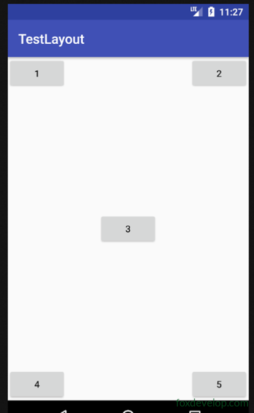
<?xml version="1.0" encoding="utf-8"?>
<RelativeLayout xmlns:android="http://schemas.android.com/apk/res/android"
    android:layout_width="match_parent" android:layout_height="match_parent">
    <Button
        android:id="@+id/button1"
        android:layout_width="wrap_content"
        android:layout_height="wrap_content"
        android:layout_alignParentLeft="true"
        android:layout_alignParentTop="true"
        android:text="1"        />
    <Button
        android:id="@+id/button2"
        android:layout_width="wrap_content"
        android:layout_height="wrap_content"
        android:layout_alignParentRight="true"
        android:layout_alignParentTop="true"
        android:text="2"        />
    <Button
        android:id="@+id/button3"
        android:layout_width="wrap_content"
        android:layout_height="wrap_content"
        android:layout_centerInParent="true"
        android:text="3"        />
    <Button
        android:id="@+id/button4"
        android:layout_width="wrap_content"
        android:layout_height="wrap_content"
        android:layout_alignParentLeft="true"
        android:layout_alignParentBottom="true"
        android:text="4"        />
    <Button
        android:id="@+id/button5"
        android:layout_width="wrap_content"
        android:layout_height="wrap_content"
        android:layout_alignParentRight="true"
        android:layout_alignParentBottom="true"
        android:text="5"        />
</RelativeLayout>Code language: HTML, XML (xml)
Position relative to other controls
Use android:layout_above=”@id/button3″
to place one control above another.
Use layout_below to place a control below another control.
layout_toLeftOf puts a control to the left of the target control.
layout_toRightOf puts a control to the right of the target control.
Important: When positioning a control relative to another, the referenced control must be declared earlier in XML.
Place button1 in the center and define it first in XML, then position the other four controls relative to it
<?xml version="1.0" encoding="utf-8"?>
<RelativeLayout xmlns:android="http://schemas.android.com/apk/res/android"
    android:layout_width="match_parent" android:layout_height="match_parent">
    <Button
        android:id="@+id/button1"
        android:layout_width="wrap_content"
        android:layout_height="wrap_content"
        android:layout_centerInParent="true"
        android:text="1"        />
    <Button
        android:id="@+id/button2"
        android:layout_width="wrap_content"
        android:layout_height="wrap_content"
        android:layout_above="@id/button1"
        android:layout_toLeftOf="@id/button1"
        android:text="2"        />
    <Button
        android:id="@+id/button3"
        android:layout_width="wrap_content"
        android:layout_height="wrap_content"
        android:layout_above="@id/button1"
        android:layout_toRightOf="@id/button1"
        android:text="3"        />
    <Button
        android:id="@+id/button4"
        android:layout_width="wrap_content"
        android:layout_height="wrap_content"
        android:layout_below="@id/button1"
        android:layout_toRightOf="@id/button1"
        android:text="4"        />
    <Button
        android:id="@+id/button5"
        android:layout_width="wrap_content"
        android:layout_height="wrap_content"
        android:layout_below="@id/button1"
        android:layout_toLeftOf="@id/button1"
        android:text="5"        />
</RelativeLayout>Code language: HTML, XML (xml)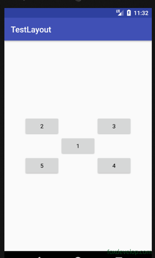
Layout – FrameLayout
Simpler than the previous two layouts
It is used in fewer practical scenarios.
This layout does not have convenient directional positioning. All controls default to the top-left corner of the container.
Let’s test it by adding a TextView and an ImageView
You can use layout_gravity to set alignment inside the layout.
<?xml version="1.0" encoding="utf-8"?>
<FrameLayout xmlns:android="http://schemas.android.com/apk/res/android"
    android:layout_width="match_parent" android:layout_height="match_parent">
    <ImageView
        android:layout_width="wrap_content"
        android:layout_height="wrap_content"
        android:src="@drawable/img1"    />
        />
    <Button
        android:layout_width="wrap_content"
        android:layout_height="wrap_content"
        android:text="foxdevelop.com"
        android:layout_gravity="right"
        />
</FrameLayout>Code language: HTML, XML (xml)
Extended Layout – Percent Layout
The above three layouts exist since Android 1.0
They are still in use today.
But only LinearLayout supports layout_weight for percentage-based sizing. The other two layouts do not.
For example, splitting two buttons equally inside RelativeLayout is difficult.
Thankfully, Android 7.0 introduced percent layouts.
These are extensions of RelativeLayout and FrameLayout, prefixed with Percent.
They extend the two older layout types.
Add the percent layout dependency inside build.gradle.
Open app/build.gradle
Add this line inside dependencies
compile ‘com.android.support:percent:27.1.1’
After modifying build.gradle, Gradle syncs automatically to pull the percent library. No extra manual steps needed.
Then change your root layout to
<android.support.percent.PercentFrameLayout
Set these attributes on child views
app:layout_widthPercent=”50%”
app:layout_heightPercent=”50%”
You can still use layout_gravity on child controls as well
Custom Views & Reusing Layout Files
Inheritance diagram for Views and Layouts
All UI controls we use inherit directly or indirectly from View.
All layout containers inherit directly or indirectly from ViewGroup.
View is Android’s fundamental UI component.
It draws a rectangular area on screen and responds to events inside that region.
Reusing layouts
Many iOS apps share a similar UI: back button top-left, title on top.
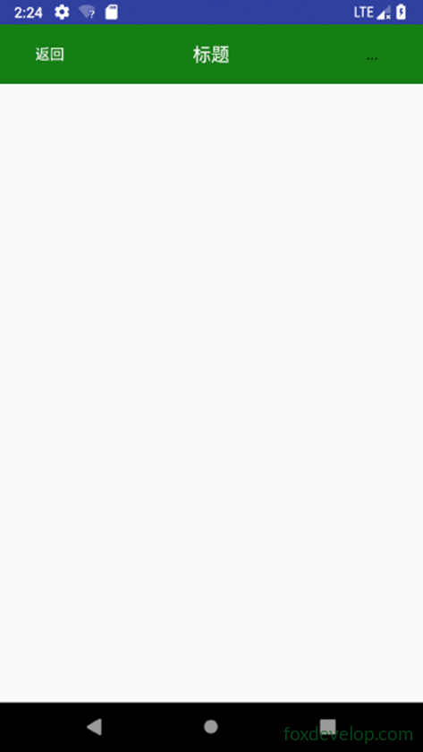
We will replicate this style.
Adding a button and TextView is straightforward for us now.
But copying this code on every page creates lots of duplicate code.
We solve this by reusing layout files.
Create a new file justtitle.xml
Create new project TestCustom
Add layout file named justtitle.xml
Code below
<?xml version="1.0" encoding="utf-8"?>
<LinearLayout
    xmlns:android="http://schemas.android.com/apk/res/android"
    android:layout_width="match_parent"
    android:layout_height="wrap_content"
    android:background="#137e11"
    >
    <Button
        android:id="@+id/button1"
        android:layout_width="wrap_content"
        android:layout_height="wrap_content"
        android:layout_gravity="center"
        android:layout_margin="5dp"
        android:text="Back"
        android:textColor="#fff"
        android:background="@null"
        />
    <TextView
        android:id="@+id/textview"
        android:layout_width="0dp"
        android:layout_weight="1"
        android:layout_height="wrap_content"
        android:gravity="center"
        android:layout_gravity="center"
        android:text="Title"
        android:textSize="18dp"
        android:textColor="#fff"
        android:background="@null"
        android:layout_margin="5dp"
        />
    <Button
        android:id="@+id/button"
        android:layout_width="wrap_content"
        android:layout_height="wrap_content"
        android:layout_gravity="center"
        android:text="..."
        android:layout_margin="5dp"
        android:background="@null"
        />
</LinearLayout>Code language: HTML, XML (xml)
Modify main activity view with code below
Use include to import justtitle.xml
<?xml version="1.0" encoding="utf-8"?>
<LinearLayout
    xmlns:android="http://schemas.android.com/apk/res/android"
    android:layout_width="match_parent"
    android:layout_height="match_parent"
    >
    <include layout="@layout/justtitle"/>
</LinearLayout>Code language: HTML, XML (xml)
Add a BasicActivity and override onCreate
Hide the default ActionBar
package com.foxdevelop.www.testcustom;
import android.os.Bundle;
import android.support.v7.app.ActionBar;
import android.support.v7.app.AppCompatActivity;
public class BasicActivity extends AppCompatActivity {
    @Override
    protected void onCreate(Bundle savedInstanceState) {
        super.onCreate(savedInstanceState);
        ActionBar actionBar = getSupportActionBar();
        if (actionBar!=null)
        {
            actionBar.hide();
        }
    }
}Code language: JavaScript (javascript)
Using Custom Layout Controls
To properly implement back navigation
We don’t want to write back-button logic for every activity separately
We create our own custom layout by inheriting LinearLayout
Name it TitleLayout
Inside the custom layout’s constructor, attach click listeners to its buttons
public class TitleLayout extends LinearLayout {
    public TitleLayout(Context context, AttributeSet attributes) {
        super(context,attributes);
        //Inflate the corresponding layout file
        LayoutInflater.from(context).inflate(R.layout.justtitle,this);
        //Register click listener for back button
        Button button1 = (Button)findViewById(R.id.button1);
        button1.setOnClickListener(new OnClickListener() {
            @Override
            public void onClick(View view) {
                ((Activity)getContext()).finish(); //Back closes current activity
            }
        });
        //Register listener for menu button
        Button button = (Button)findViewById(R.id.button);
        button.setOnClickListener(new OnClickListener() {
            @Override
            public void onClick(View view) {
                Toast.makeText(getContext(),"Open menu",Toast.LENGTH_LONG).show();
            }
        });
    }
}Code language: JavaScript (javascript)
<?xml version="1.0" encoding="utf-8"?>
<LinearLayout
xmlns:android="http://schemas.android.com/apk/res/android"
android:layout_width="match_parent"
android:layout_height="match_parent">
<com.foxdevelop.www.testcustom.TitleLayout
android:layout_width="match_parent"
android:layout_height="wrap_content"/>
</LinearLayout>Code language: HTML, XML (xml)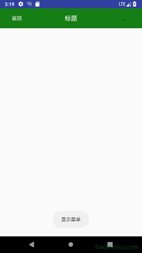
layout