Last lesson, we learned where our page UI lives, and we’ll continue learning in this session.
Understanding the Single Native WebView
Every mobile app built with NativePHP uses a single native WebView as its core container. WebViews let you build your app UI with any frontend web tools you already know. Since it’s essentially a webpage at heart, the embedded browser takes care of rendering all your web interface content.
The WebView fills the full visible screen area by default for all users to see. That said, when you launch device features like the camera, the camera capture overlay will temporarily cover the WebView.
NativePHP’s core makeup is a PHP backend paired with any frontend stack for hybrid development — Vue, jQuery, Tailwind CSS, and more all work great.
The WebView stays rendered on top permanently; only fullscreen system screens like the camera or in-app browser will cover it. The WebView itself is every piece of UI your users interact with.
Under the hood, NativePHP mobile apps run entirely inside one single WebView container — there’s no layered native multi-page architecture. This means all page navigation and back actions happen within this same WebView instance.
NativePHP mobile apps only ever have one single native WebView control active at all times. Every piece of UI across the entire app renders inside this one web container:
- Page navigation, route switches, back button actions, modals, subpages, and SPA state changes never spawn a second WebView instance. This design choice drastically cuts down memory usage.
- There is no native multi-page stack system like Android Activities or iOS ViewControllers layered on top of each other;
- What users perceive as “multiple separate pages” are just frontend route changes (Laravel routing, Livewire, Vue Router, etc.) swapping DOM elements inside the single WebView — identical logic to standard single-page web applications.
1. Viewport Configuration (Meta Tag Screen Adaptation)
Anyone who’s built mobile web pages before will recognize this setup right away.
Just like standard desktop and mobile browsers, WebViews use the viewport concept to define the page’s visible bounds, controlled entirely via meta tags with identical syntax to regular websites.
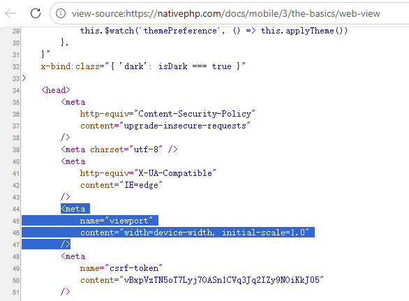
<meta name="viewport" content="width=device-width, initial-scale=1">Code language: HTML, XML (xml)Add this meta tag to all your HTML or Blade PHP templates. In today’s mobile-first web landscape, nearly every site includes this tag to properly adapt layouts for mobile device browsers. Without it, your page text will look tiny and cramped: mobile screens have very high DPI, and the browser will render content scaled for desktop monitors by default, creating cramped typography and broken layout formatting.
You can check this yourself on any live site — take the official NativePHP docs page here: Web View – NativePHP mobile v3 – NativePHP. Right-click anywhere on the page and select View Page Source to see the tag in action.
This viewport tag has two key attributes we’ll break down:
width=device-width: Matches the page’s width exactly to the physical width of the device’s screen
initial-scale=1: Locks the page’s starting zoom level to a 1:1 ratio with no automatic scaling in or out
2. Disable Pinch-to-Zoom (Match Native App Feel)
You can’t zoom in or out using a two-finger pinch gesture on standard native Android or iOS apps, but mobile web browsers allow this behavior freely. To make your NativePHP app feel indistinguishable from fully native software, we need to turn this zoom functionality off for users.
When building mobile apps, full control over your interface layout is critical. Disabling manual page scaling creates a consistent experience matching true native mobile applications.
Append the following property to your existing viewport meta tag:
<meta name="viewport" content="width=device-width, initial-scale=1, user-scalable=no">Code language: HTML, XML (xml)user-scalable=no: Blocks all manual pinch zoom gestures from users
3. Edge-to-Edge Full Screen Rendering (Notch & Curved Screen Prep)
To give your UI designers maximum layout flexibility, the WebView defaults to rendering edge-to-edge across the entire screen. Using only HTML, CSS and JavaScript, you can place content anywhere on screen while the app stays in the foreground.
One major caveat: not every section of the screen is safe for interactive content. Most modern phones feature camera notches, rounded screen corners, curved display edges, and Apple’s Dynamic Island. These areas still count as part of the viewport, but content placed there will be covered and un-tappable for users.
To properly support cutout-shaped screens, add viewport-fit=cover to your viewport meta tag and pair it with Safe Area Inset styling rules.
<meta name="viewport" content="width=device-width, initial-scale=1, user-scalable=no, viewport-fit=cover">Code language: HTML, XML (xml)viewport-fit=cover: Lets page rendering extend all the way to the absolute screen edges, including notches and rounded corners. Important note: enabling this parameter alone will leave your content hidden behind hardware cutouts — you must combine it with Safe Area CSS styling, covered in the next section.
Safe Areas
Safe Areas refer to screen regions that stay fully unobstructed for content: areas never covered by physical hardware features (rounded corners, camera notches, Dynamic Island) or persistent system UI (bottom home gesture bar, top status bar).
Each device automatically calculates its Safe Area bounds, adjusting dynamically whenever users switch between portrait and landscape screen orientations. NativePHP supplies simple built-in CSS variables to handle responsive layout adjustments across all device types automatically.
<!-- Add global safe area constraints to the body tag -->
<body class="nativephp-safe-area">
    <!-- Top header with left/right padding for screen curve insets -->
    <div class="fixed top-0 left-0 w-full bg-red-500 pl-[var(--inset-left)] pr-[var(--inset-right)]">
        Top Navigation Bar
    </div>
</body>Code language: HTML, XML (xml)--inset-top: Top safe padding (height of status bar / camera notch)--inset-bottom: Bottom safe padding (height of home gesture bar)--inset-left: Left-side safe margin for curved / rounded screen edges--inset-right: Right-side safe margin for curved / rounded screen edges
All of these CSS styles and variables come pre-built into NativePHP Mobile — the framework injects them automatically, so there’s no need to import extra third-party CSS libraries manually.
Quick global helper CSS class: nativephp-safe-area
Simply attach this class to your root HTML container elements to automatically lock all page content within safe boundaries and streamline your development workflow, as shown in the sample code above.
Let’s walk through a comparison test. Below is an official example without any safe area handling, which we’ll use to break down the core concept first before testing on physical hardware. Here’s what happens when you skip safe area adjustments:
<div class="fixed top-0 left-0 w-full bg-red-500">
    ...
</div>Code language: HTML, XML (xml)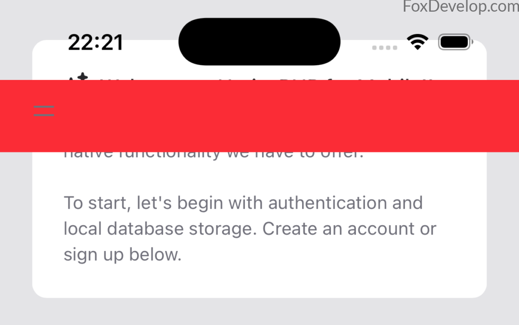
As you can see in the screenshot, our top header bar renders directly underneath the front camera cutout.
The layout breaks even worse once you rotate the device into landscape mode, like this example:
In landscape orientation, large empty gaps appear along both left and right screen edges that render content unusable. Even the top header bar fails to stretch fully across the width, creating an uneven, unpolished visual look.
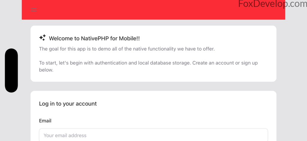
Now add the official built-in safe area styling directly to your body tag, like so:
<body class="nativephp-safe-area">
<div class="fixed top-0 left-0 w-full bg-red-500 pl-[var(--inset-left)] pr-[var(--inset-right)]">
    ...
</div>Code language: HTML, XML (xml)
The difference is night and day — the full UI now fills the entire screen cleanly.
Editing the Source Code
We’ll modify the official starter template file we worked with last lesson: welcome.blade.php
Replace the contents inside your body tag with the markup below. We’re using Tailwind CSS here, a popular frontend UI utility library comparable to Bootstrap.
<!DOCTYPE html>
<html lang="{{ str_replace('_', '-', app()->getLocale()) }}">
    <head>
        <meta charset="utf-8">
        <meta name="viewport" content="width=device-width, initial-scale=1">

        <title>{{ config('app.name', 'Mimi') }} - Built with NativePHP : welcome to foxdevelop.com</title>

    </head>
    <body>
        <div class="fixed top-0 left-0 w-full bg-red-500">
			Top Navigation Bar
		</div>
    </body>
</html>
Code language: HTML, XML (xml)
Save your file, open a command prompt window navigated to your project root folder, then run the following command:
php artisan native:jumpCode language: CSS (css)D:\phpproject\my-app>php artisan native:jumpCode language: CSS (css)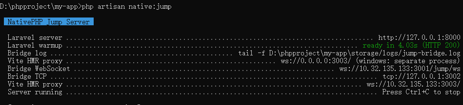
Visit this local address in your browser: http://127.0.0.1:8000
You won’t be able to test the notch and safe area behavior accurately in a desktop browser — we’ll need to deploy to a physical mobile device next.
Physical Device Debugging
Just like standard Android development workflows, grab an Android smartphone and connect it to your PC via a USB data cable. You’ll need to turn on Developer Options on your phone; a quick Google search will walk you through the exact steps for your device model. You also need ADB, Google’s official command-line tool for controlling connected Android devices — it’s included automatically when you fully install Android Studio.
Download and fully set up Android Studio, including the Android SDK and SDK Platform Tools bundle (which ships with ADB debugging utilities).
Verify your ADB installation works correctly first.
Open your terminal and run this command: adb devices
D:\phpproject\my-app>adb devices
List of devices attached
a34354354354352    deviceCode language: PHP (php)
You’ll see output like this when your phone connects successfully.
Navigate back to your project root in Command Prompt, then execute this build command: php artisan native:run android
D:\phpproject\my-app>php artisan native:run android

  Running NativePHP for Android

 Build log: D:\phpproject\my-app\nativephp\android-build.log

  Updating Android configuration ....................................................................... 903.01ms DONE
  Copying Laravel source .................................................................................... 18s DONE
  Installing Composer dependenciesCode language: PowerShell (powershell)
This build pipeline will pull multiple dependencies including Kotlin build tools and Gradle, so ensure you have a stable internet connection during the process.
If you encounter slow download speeds or connection failures, you can configure a mirror proxy by editing this file in your project directory: D:\phpproject\my-app\nativephp\android\gradle\wrapper\gradle-wrapper.properties
Swap out the default distribution URL with an Alibaba mirror address like this example:
#Mon Feb 10 07:33:27 EST 2025
distributionBase=GRADLE_USER_HOME
distributionPath=wrapper/dists
#distributionUrl=https\://services.gradle.org/distributions/gradle-8.13-bin.zip
distributionUrl=https\://mirrors.aliyun.com/maven/gradle/gradle-8.13-bin.zip
zipStoreBase=GRADLE_USER_HOME
zipStorePath=wrapper/dists
Code language: Properties (properties)